
How to ground a web experience in research

Cooperativa de Energie is a Romanian energy coop startup. They reached out to me to help with their website.

Romania is new on the stage of energy cooperatives. The business model is unclear to the audience, as well as its advantages. Moreover, the startup needed to attract investors to support its development.

  • Operate in a space where there is no benchmark
  • Distill requirements into actionable points
  • Organise planning workshop
  • Audience research
  • Website architecture
  • User flows
  • Low-fi wireframes
Step 1

Sometimes the requirement is simple: make it better. And that’s ok. Knowing something needs improvement is the first step. But how does better look like? And, more importantly, how to get there?

That is what workshops are for. The first step in improving the energy coop web experience was to sit down with the stakeholders and understand the business model, plan, audience and needs. It all boils down to the following diagram: the web experience is to be found at the intersection of specific business goals and audience needs. That translates into 4 user flows (Join, Onboard, Invest, Educate). The website should answers the following questions: what is the energy coop, why is it good, how does it work, and how can I become a member/consumer/investor.

Step 2

Almost every project begins with a simple question: who is this for? The clearer that answer becomes, the easier it is to shape work that actually meets its goals.

From the workshop, three main groups emerged:

  1. Existing coop members / investors who hadn’t taken the next step toward becoming consumers;
  2. Consumers who were neither members nor investors;
  3. Members / consumers / investors who needed one platform to track their energy consumption, pay bills and stay up to date with coop events.

We approached this through surveys and interviews, tailoring our questions to the specific journey of each group. For those already close to the coop, we looked at what initially resonated with them. For those further away, we focused on the barriers, seeking to understand what was preventing them from moving closer.

Steps 3 & 4

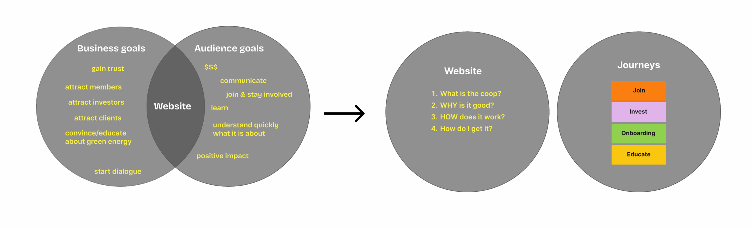
Audience research brought a necessary clarity to who we were speaking to and what the website needed to say. These insights, paired with the requirements from our initial workshop, defined the site’s structure. We focused on four primary user flows: joining, onboarding, education, and investing.

The experience became more tailored within the authenticated area. Upon logging in, the journey for consumers focused on Joining and Onboarding, while existing members and investors were invited to explore the transition toward becoming consumers.

Education remained a constant thread throughout the site, woven into the experience through statistics and FAQs to ensure that every interaction felt both informed and intentional.

Do you believe in magic?

From aerospace engineering to content design? I can understand your confusion. But unicorns are real. Don’t believe me? Let’s connect.

Let’s connect

T: +44 7454 566 293
E: hello@oanapetrache.com

LinkedIn

© 2026 Oana Petrache